

Case Studies
Brand and experience transformations from A to Z for B2C, B2B and B2G
Case Studies
Brand and experience transformations from A to Z for B2C, B2B and B2G
Case Studies
Brand and experience transformations from A to Z for B2C, B2B and B2G

Leidos
Rotating the mechanics of wonder
Project details
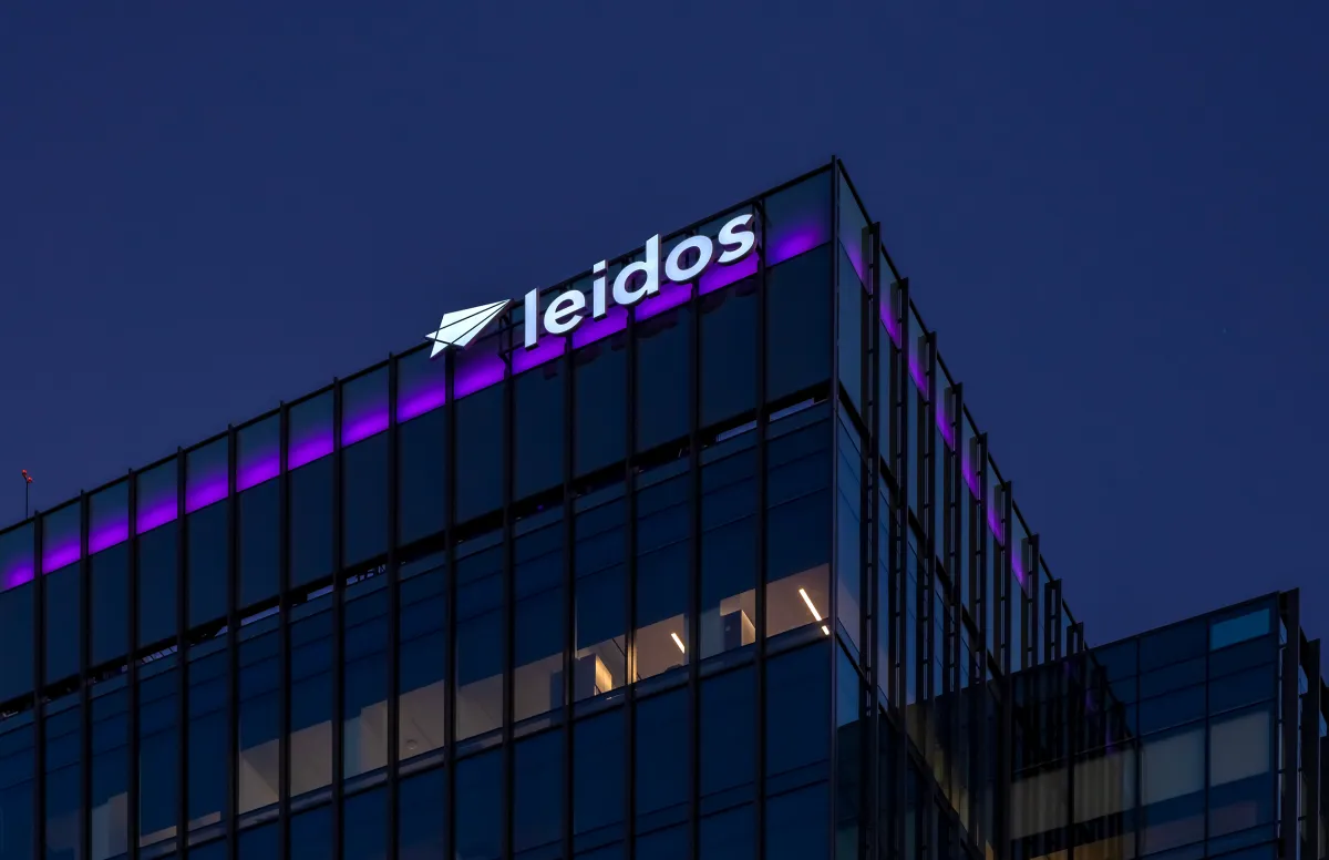
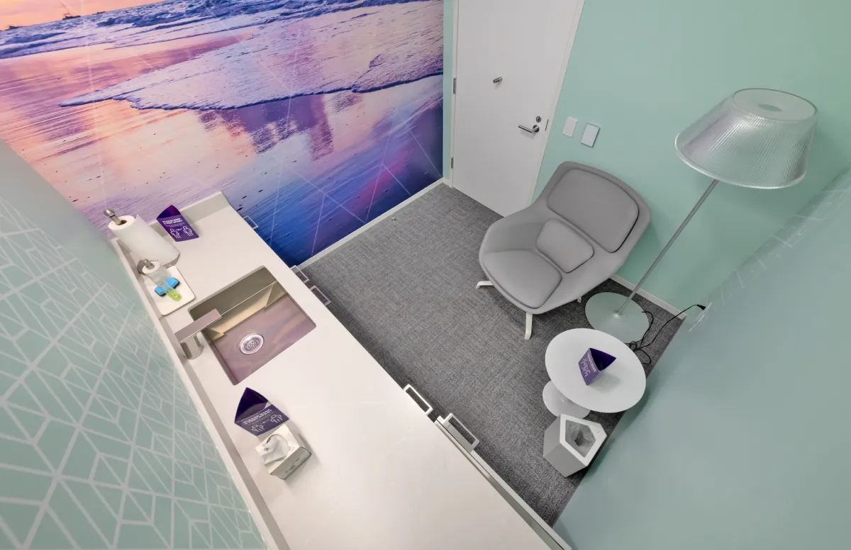
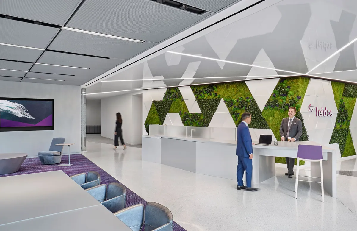
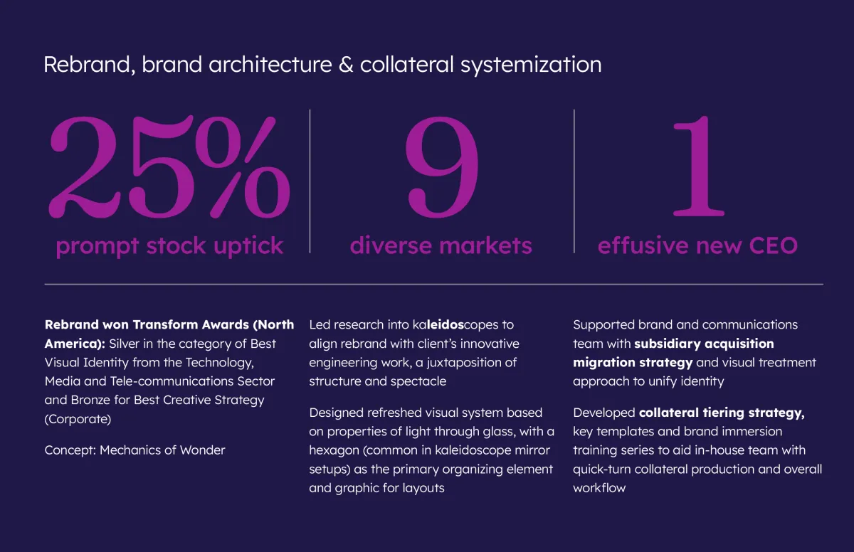
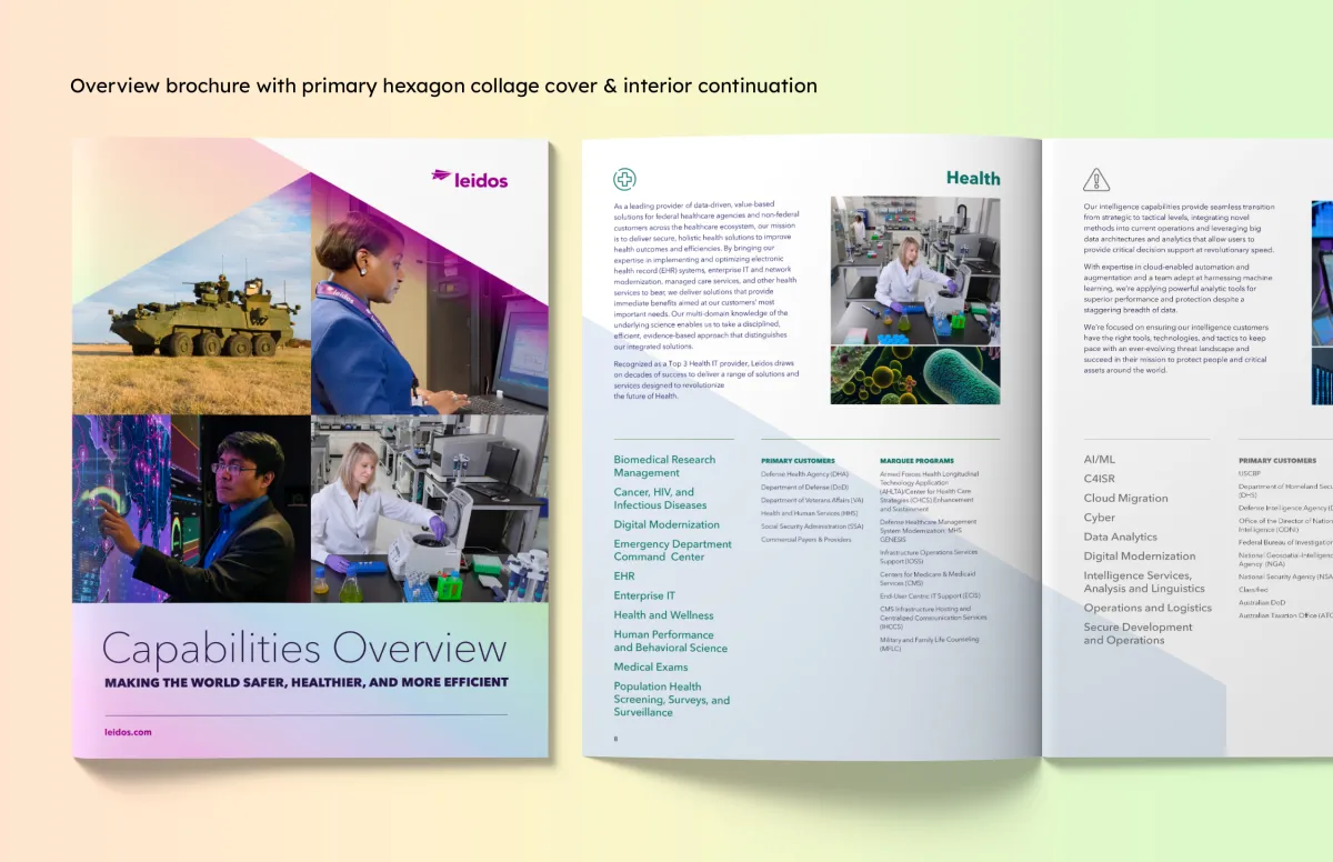
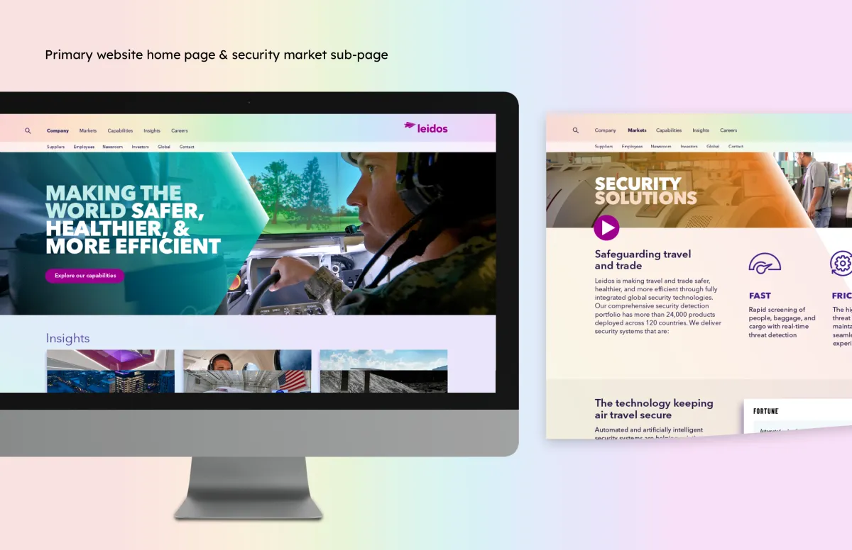
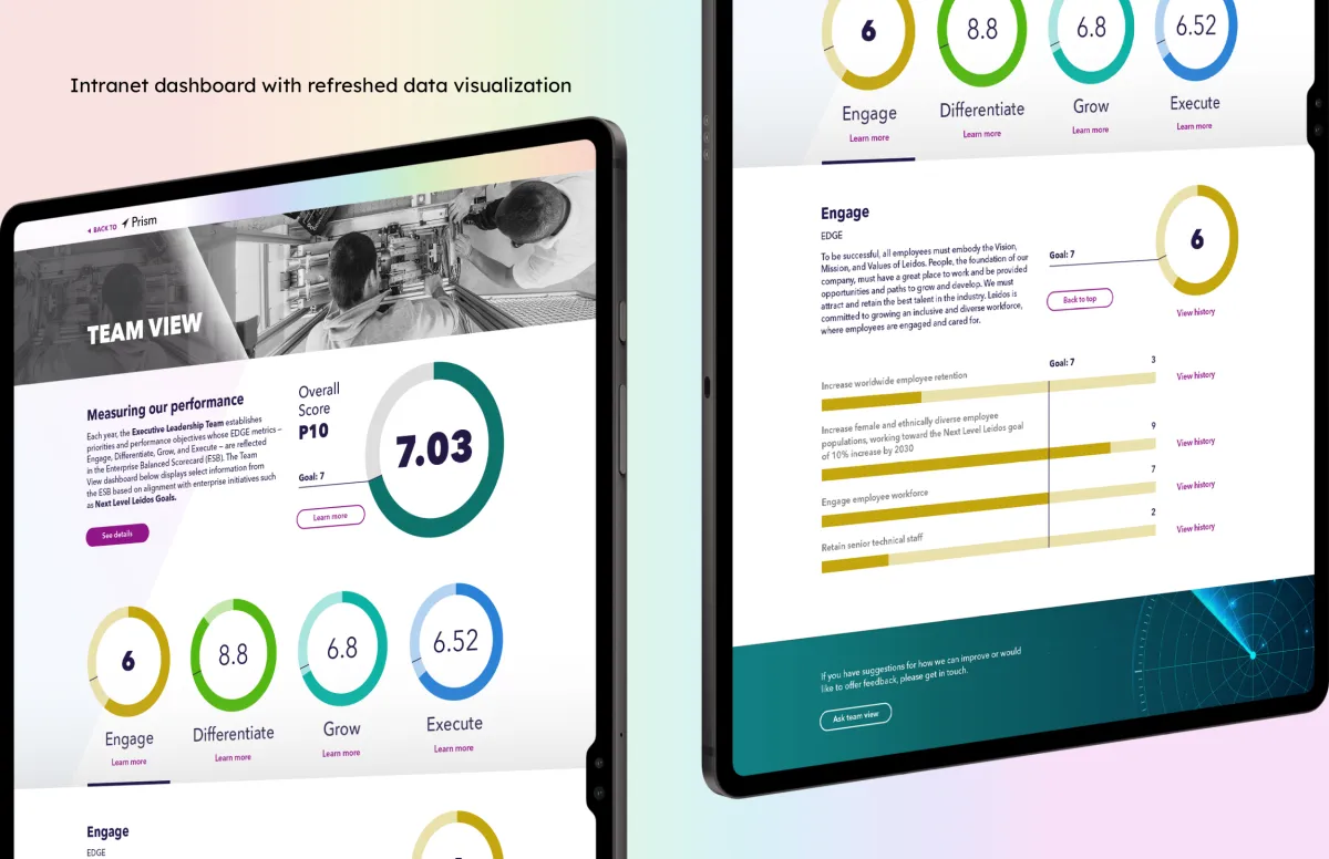
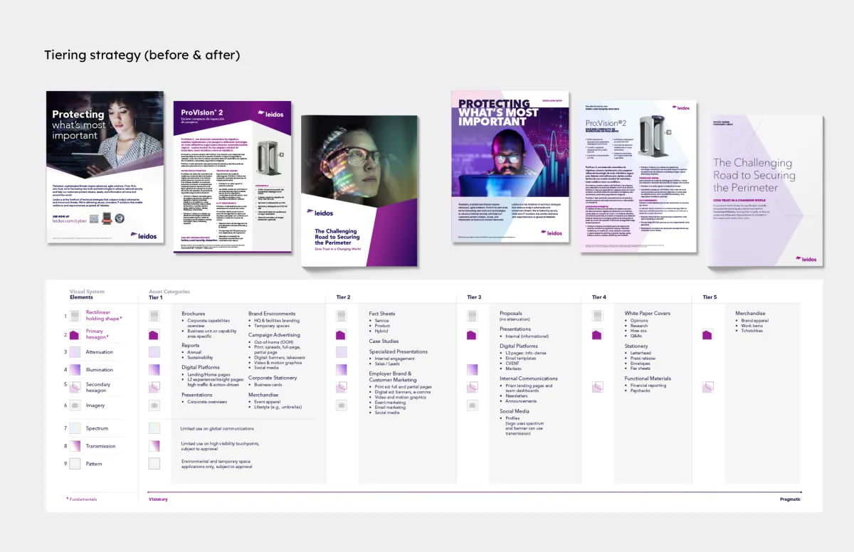
Known for its ability to tackle the world’s toughest problems, Leidos needed to solve the problem of evolving their brand identity and carrying that through physical spaces. To better reflect their core concept, the kaleidoscope, I designed a visual system focused on light, shape and rotation. Along with brand architecture and collateral tiering, this streamlined system helped consolidate their primary brand, integrate subsidiaries and recent acquisitions and prepare for an awareness campaign.
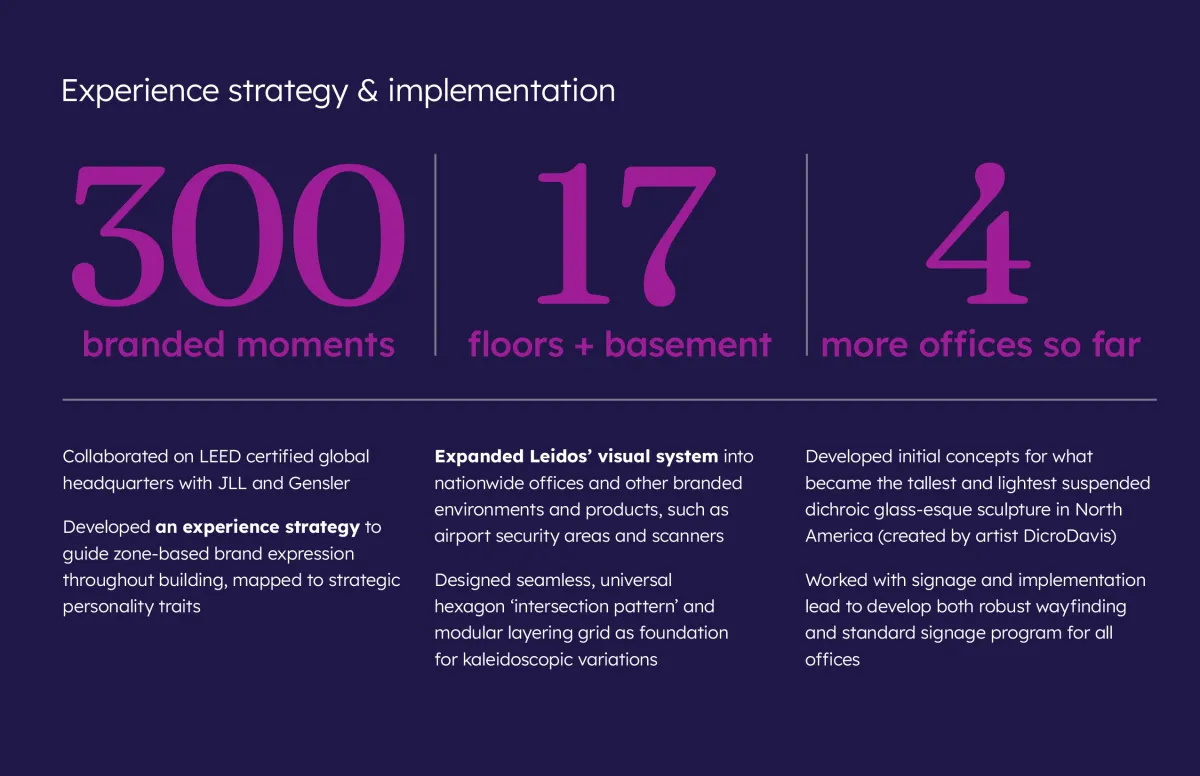
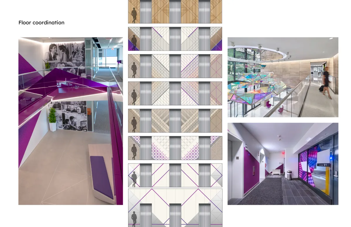
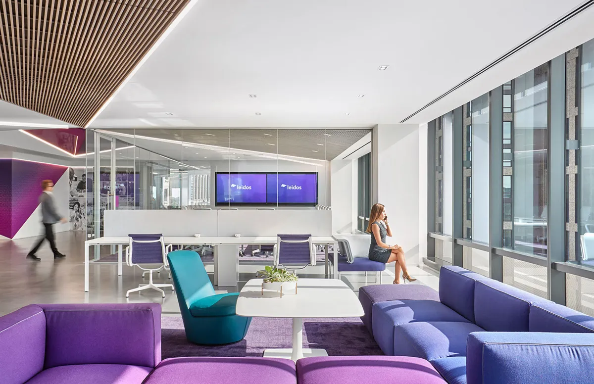
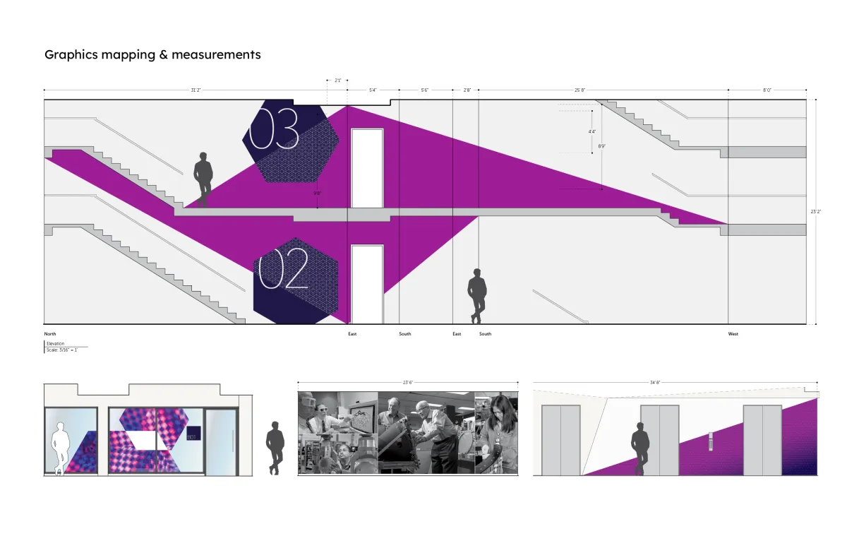
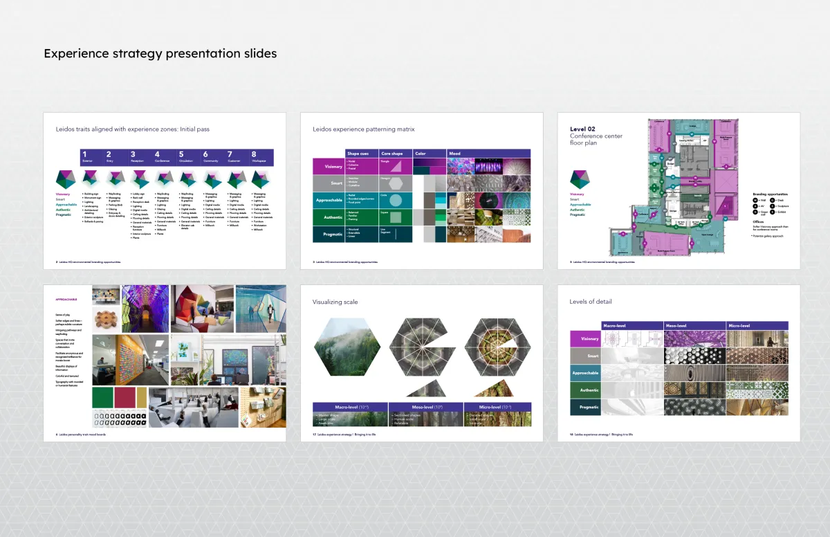
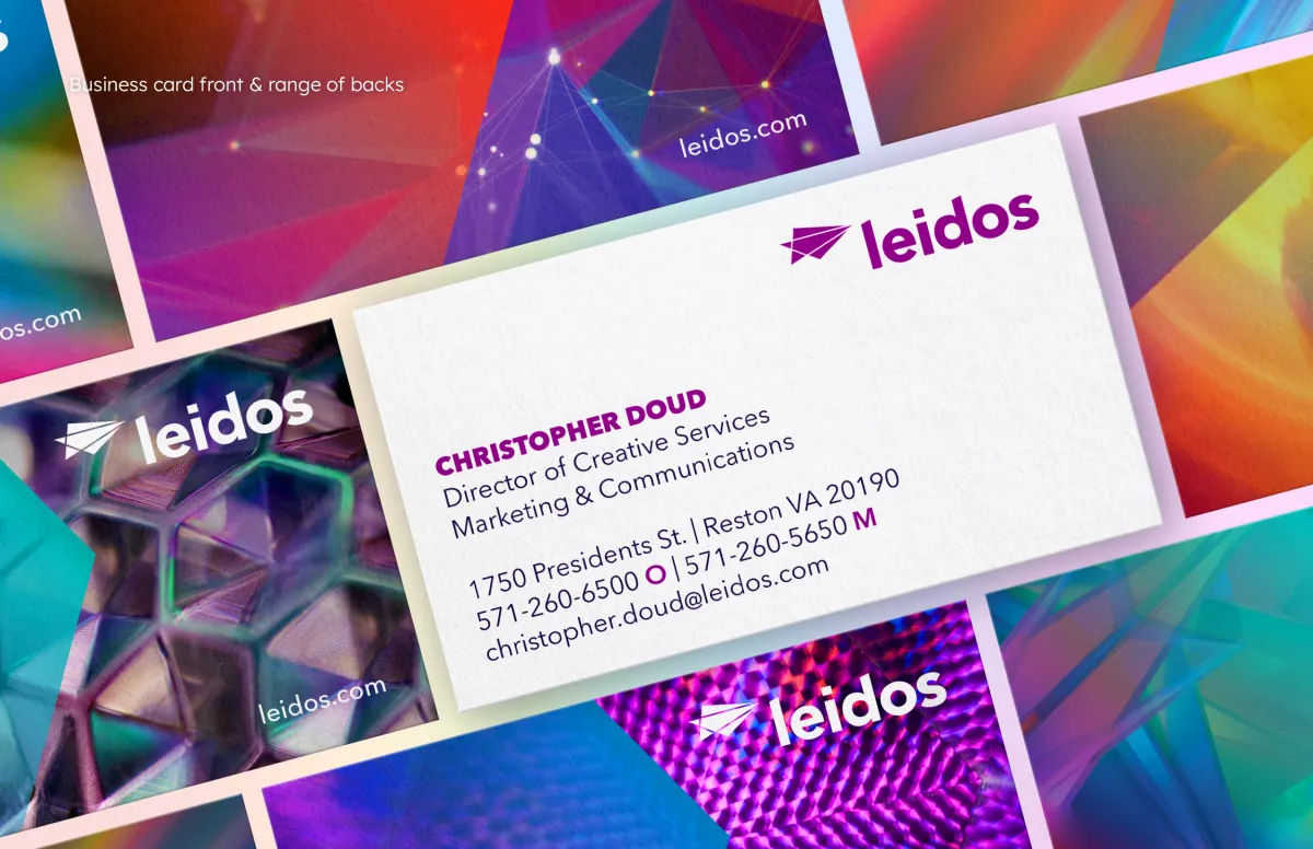
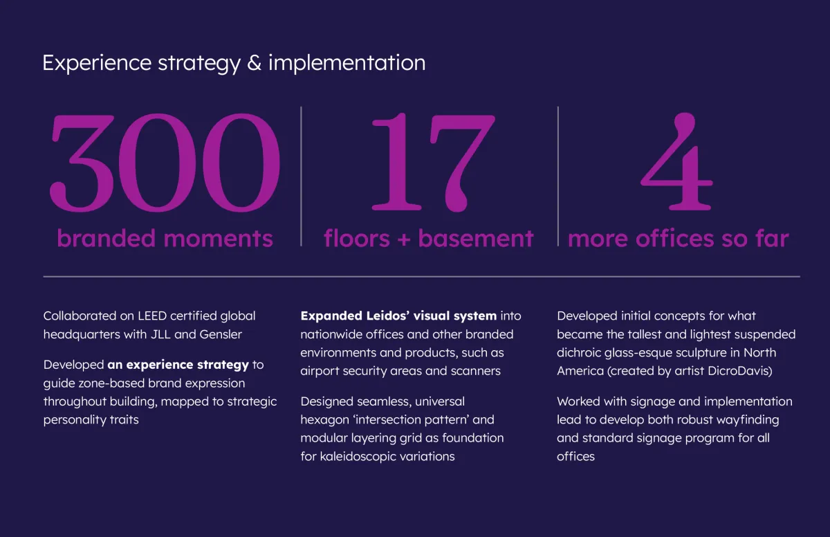
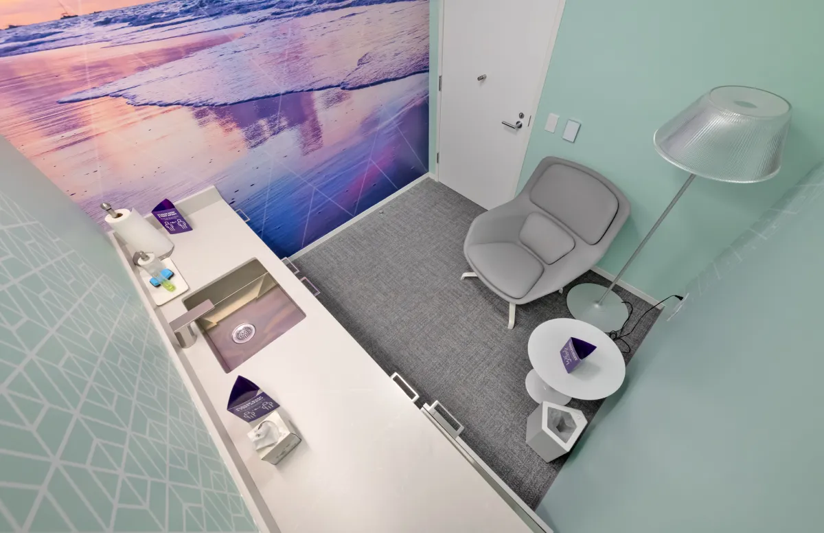
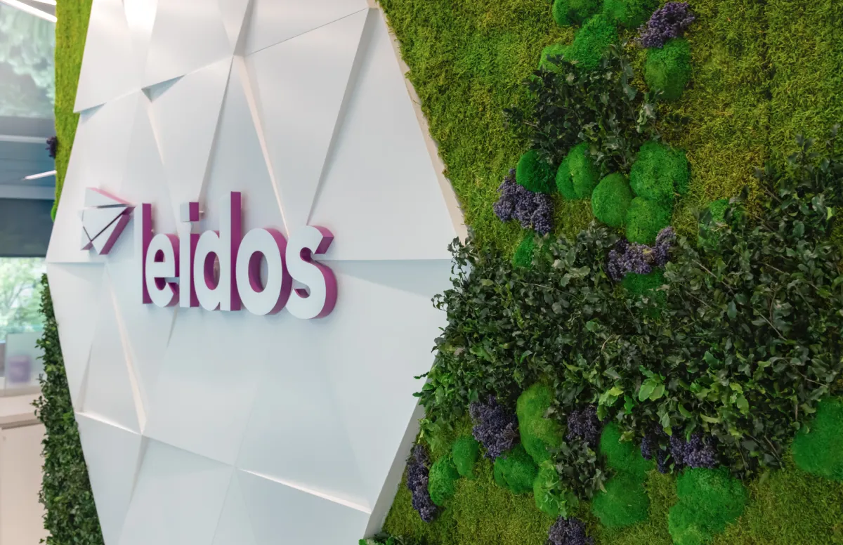
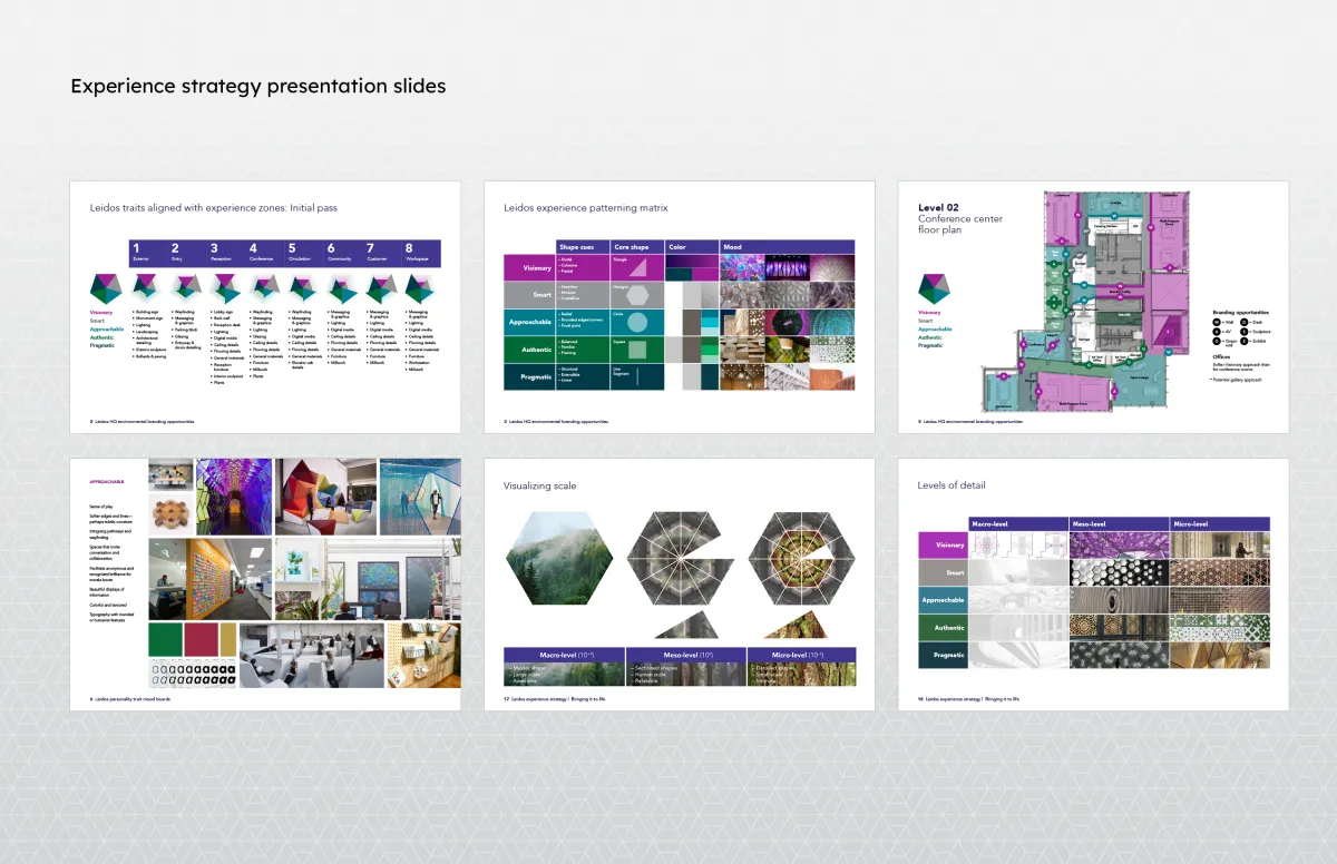
Alongside IMP’s founding partners, I developed an experience strategy that mapped Leidos’ personality attributes to colors, shapes, patterns and materials. Our system became the basis for 300 brand opportunities throughout their LEED certified headquarters. We designed and delivered everything from signage to murals to activity spaces to a green wall, and even commissioned kaleidoscopic sculptures for the lobby and executive floors.
The visual identity won two Transform Awards North America in its category: Silver for visual identity and Bronze for creative strategy.
Dolby
A resoundingly successful rebrand
Project details
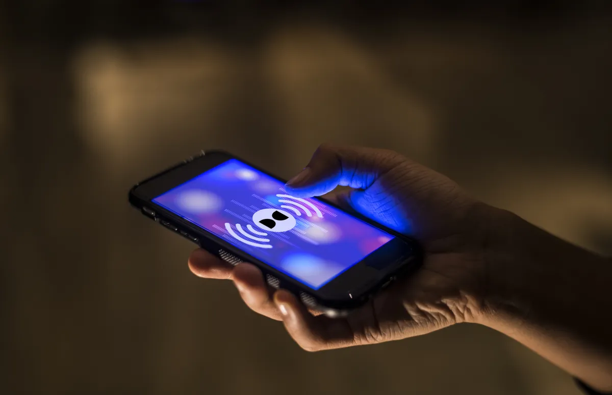
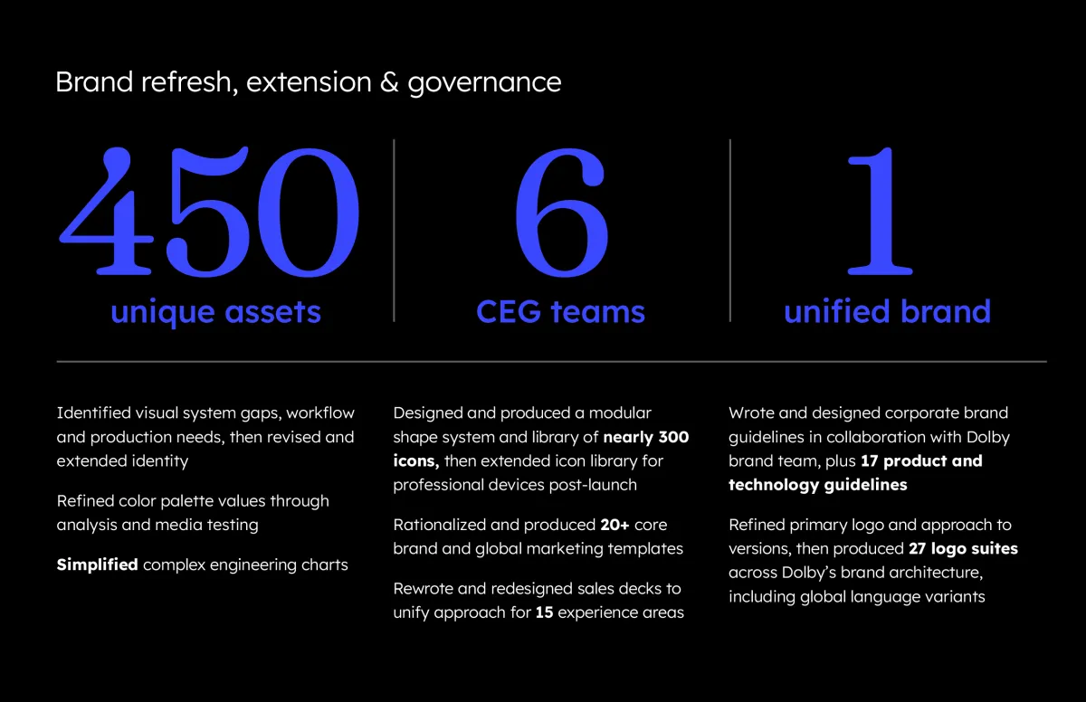
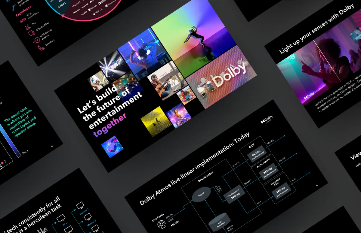
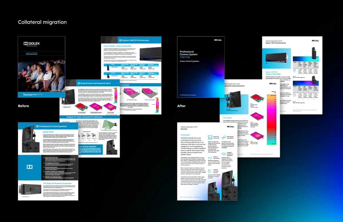
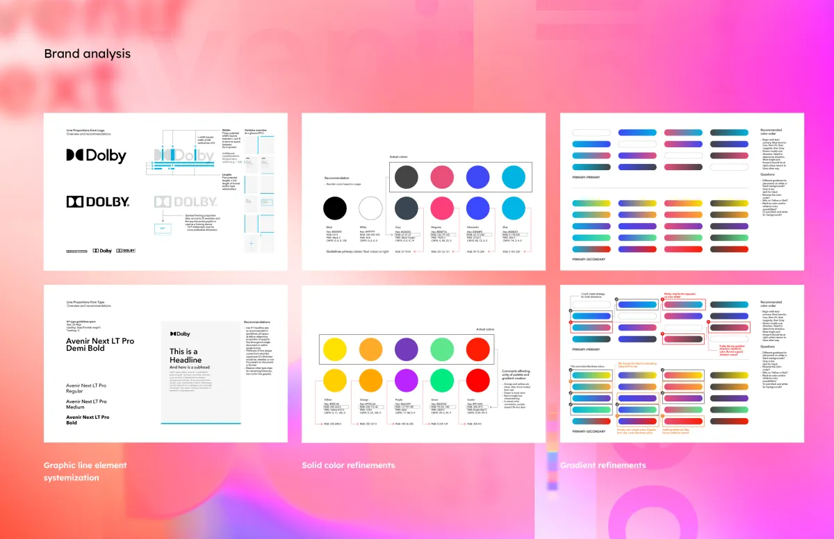
As a fractional Creative Director at Implementation Partners (IMP), I’ve had the good fortune to work with Dolby’s Consumer Entertainment and Brand groups for years on all manner of projects. From our early days creating their presentation templates and sales decks, to collaborating on the migration of their brand toward a more consumer-facing feel, it’s been rewarding to help them communicate what they innovate.
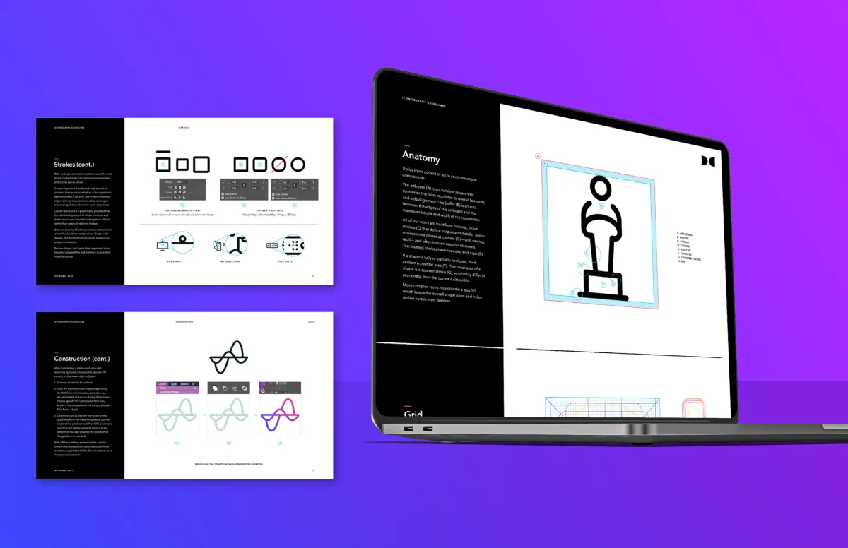
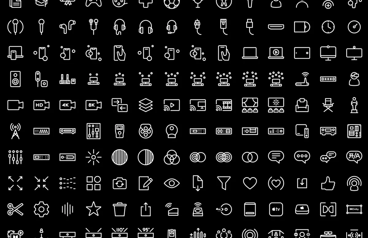
One of my favorite projects was the categorization and evolution of hundreds of icons. I created a modular grid-and-component system to ease icon development and workflow, which became useful immediately. It still is, as Dolby continues to expand their icon library to represent myriad audiovisual concepts within their experiential areas of focus.
The Sphinx Gate
Inviting an epic rite of introspection
Project details
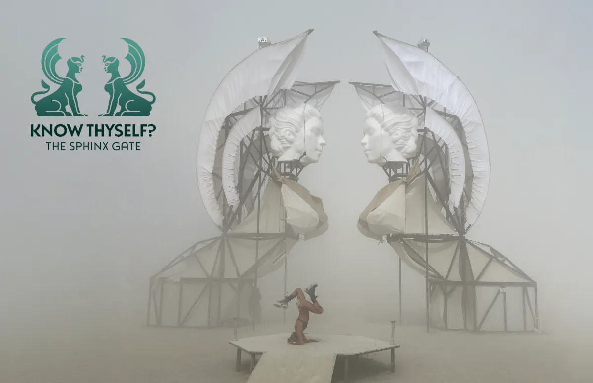
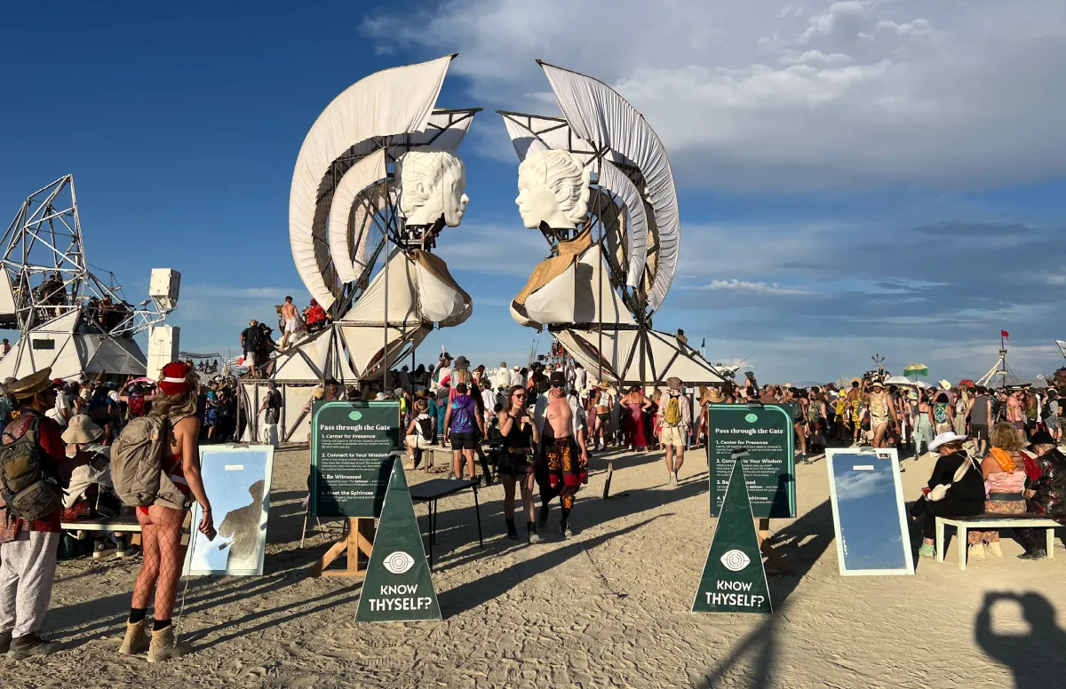
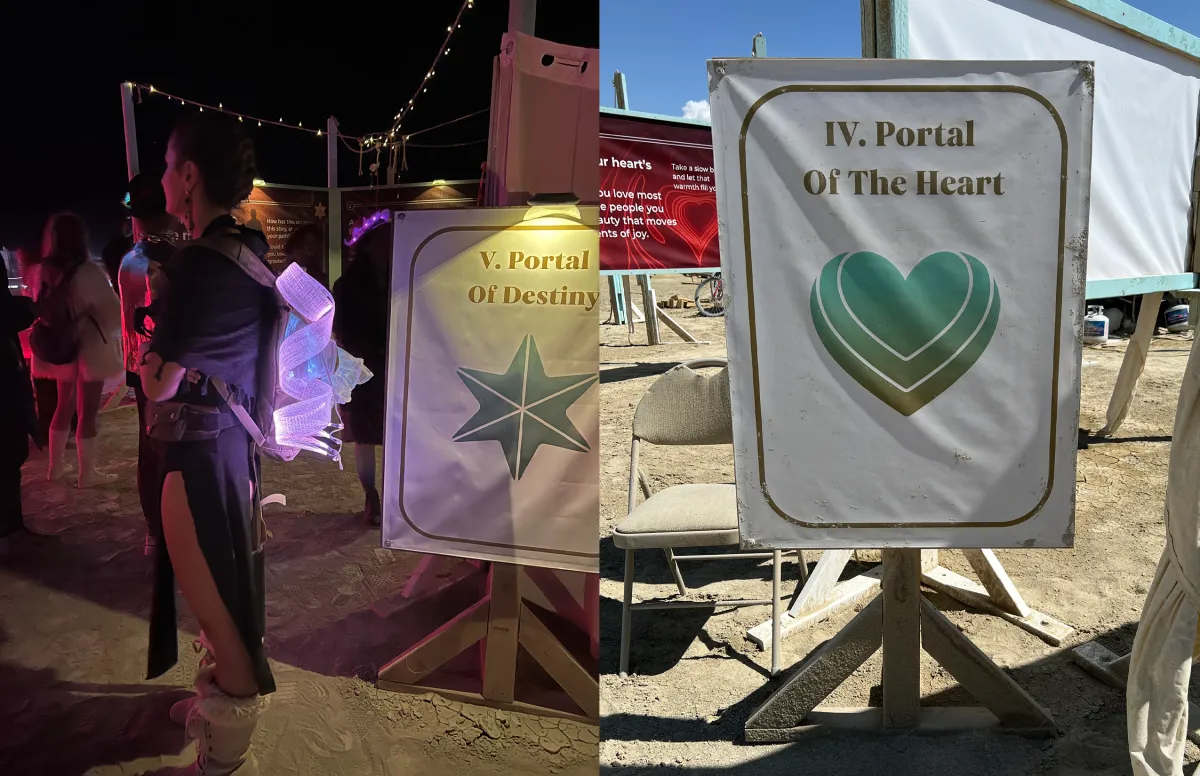
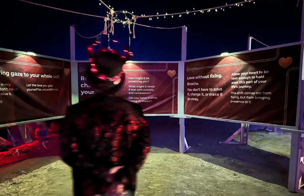
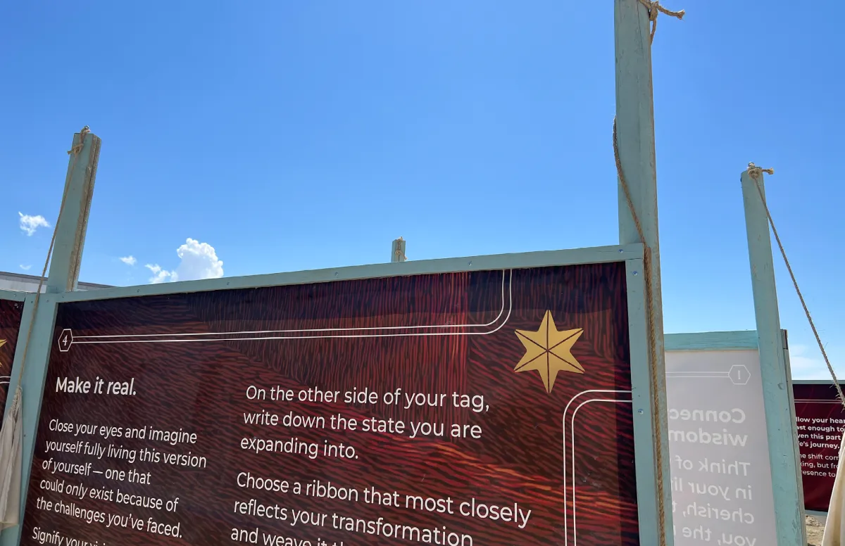
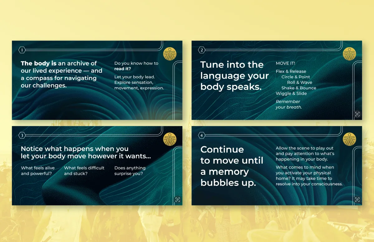
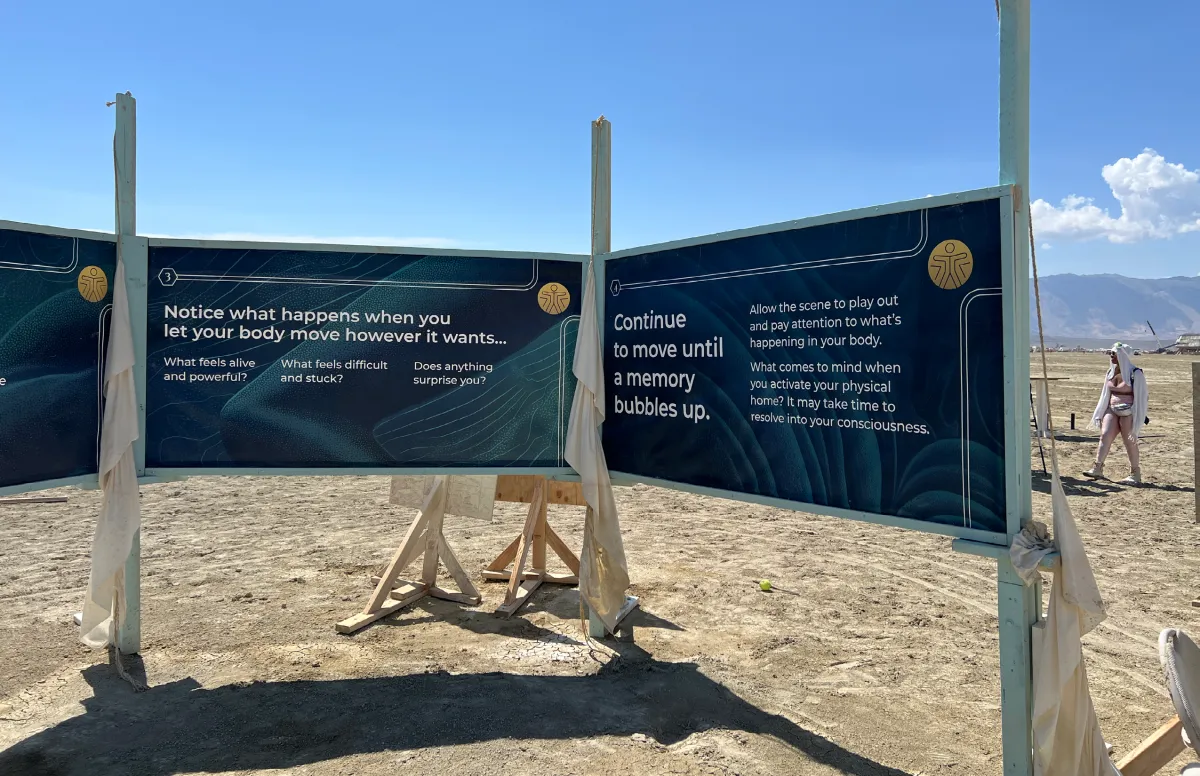
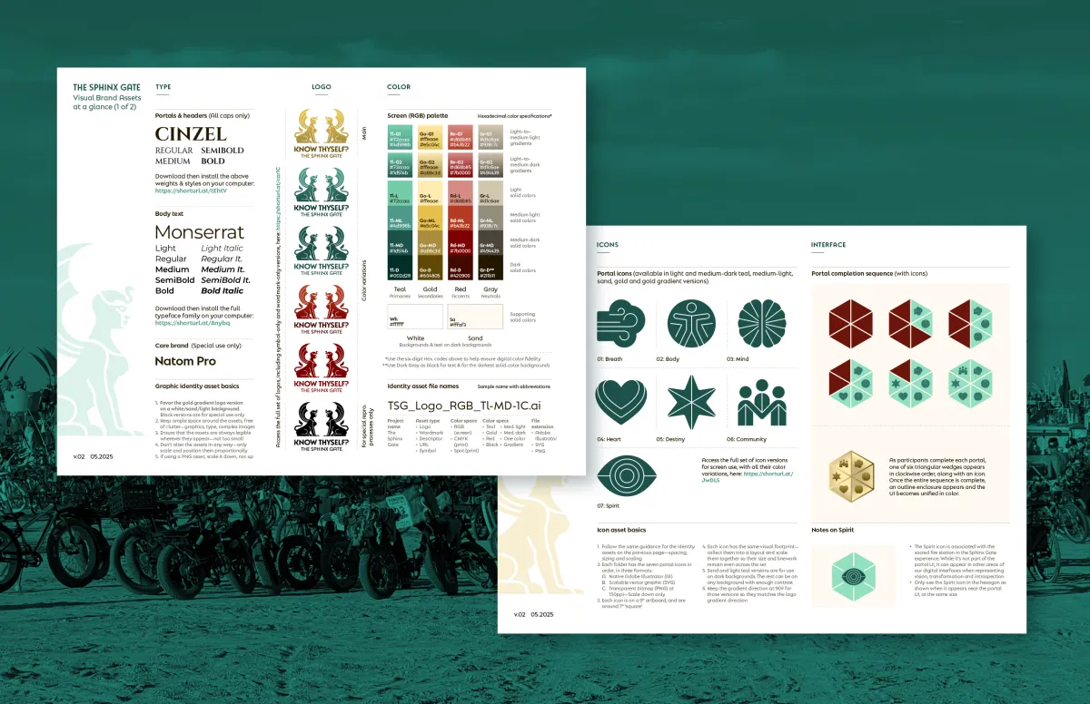
Visionary founders Mareesa Stertz and Tania Abdul had already solved a tough problem: how to design, build, and bring two thirty-four-foot sphinxes, engineered to guard a rite of passage, to Burning Man. What the project still needed was someone who could help shape the story across everything the sculptures couldn't say on their own. To close that gap, I built a visual system rooted in the ritual's four thresholds: Mind, Body, Heart, and Destiny.
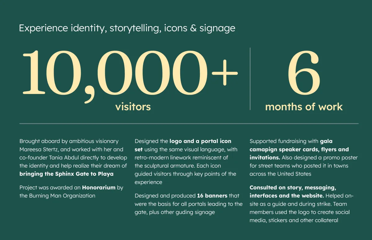
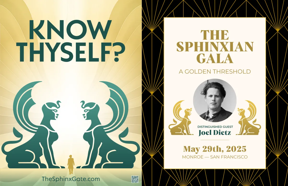
Alongside the founders, I mapped each threshold to an icon, then carried that thread through every communications surface the project touched. That included everything from promotional materials to the banners that formed the threshold portals themselves. The system became the connective tissue for a project that would go on to move thousands of seekers at the event and beyond.
The project received an Honorarium from the Burning Man Organization and was featured in Forbes for the way it turned deep inner work into something playful and communal. The same visual system is now helping carry the Sphinx Gate into its next chapter: touring festivals as Sphinx Portal.
Buffalo Bill Center of the West
Re-centering a town's crown jewel
Project details
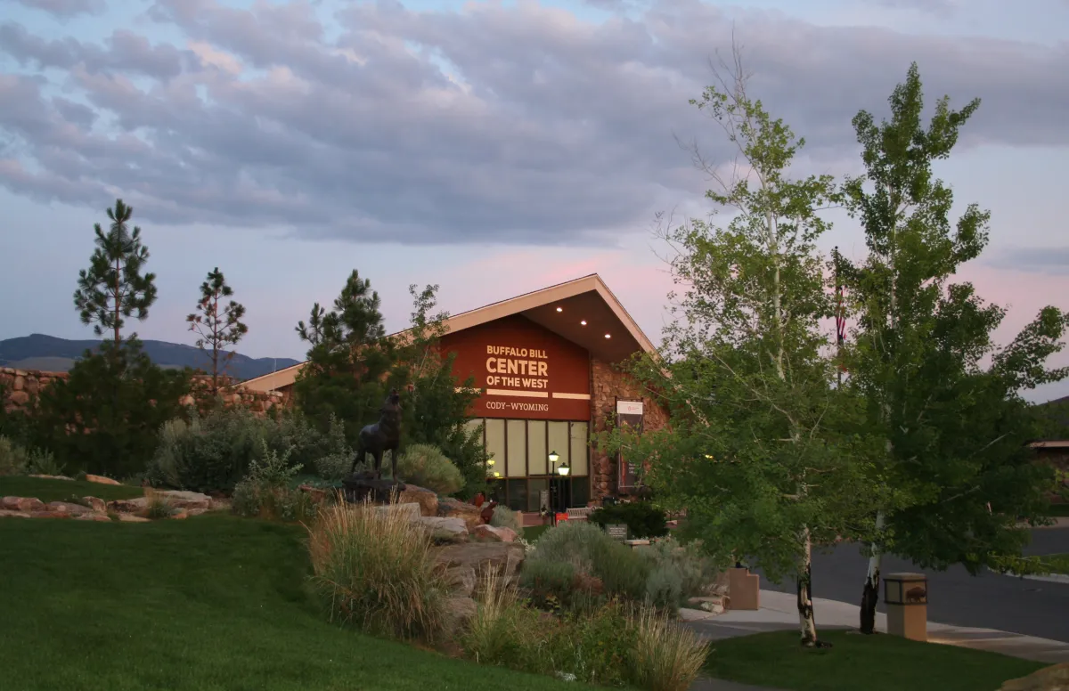
Nestled in William F. Cody’s namesake town of Cody, Wyoming, the Buffalo Bill Center of the West is a Smithsonian-affiliated, five-museum tribute to the American West. From Plains Indian artifacts to natural history to Western art, the Center displays an impressive array of stories and perspectives on our past and present.
When the Center approached Siegel+Gale to help them unify their distinct museums under one identity system and draw more visitors, we happily obliged. Over the course of about a year, I worked to elevate their identity to a level consistent with their Smithsonian Affiliation by creating a new brand platform, name, logo, wayfinding icons and other proprietary graphics.
We then implemented this identity system throughout the museums, research library, print and digital collateral, and in an ad campaign that ran in neighboring states. I also developed and ran a workshop to train their staff in the new system. On seeing the final identity, the 80-member board gave it a standing ovation.
Leidos
Rotating the mechanics of wonder
Project details
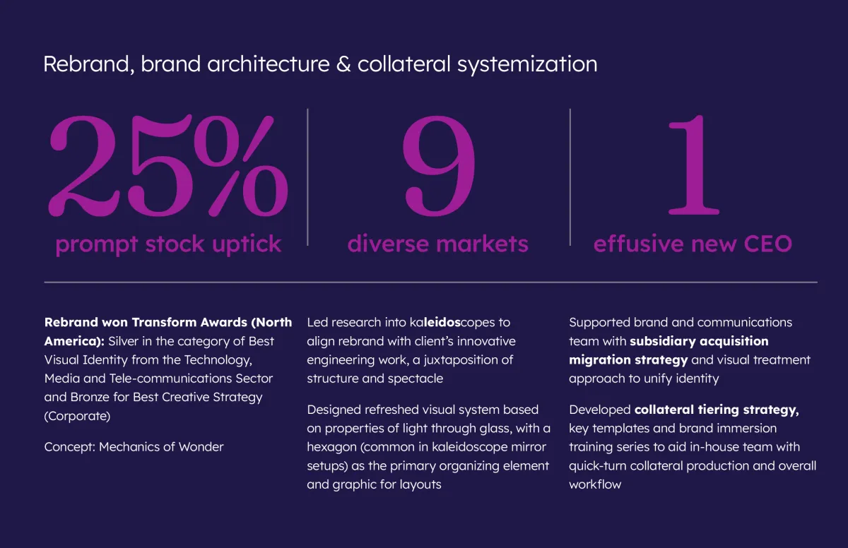
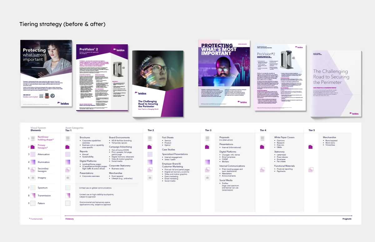
Known for their ability to tackle the world’s toughest problems, Leidos needed to solve the problem of evolving their brand identity and carrying that through physical spaces. To better reflect their core concept, the kaleidoscope, I designed a visual system focused on light, shape and rotation. Along with brand architecture and collateral tiering, this streamlined system helped consolidate their primary brand, integrate subsidiaries and recent acquisitions and prepare for an awareness campaign.
Alongside IMP’s founding partners, I developed an experience strategy that mapped Leidos’ personality attributes to colors, shapes, patterns and materials. Our system became the basis for 300 brand opportunities throughout their LEED certified headquarters. We designed and delivered everything from signage to murals to activity spaces to a green wall, and even commissioned kaleidoscopic sculptures for the lobby and executive floors.
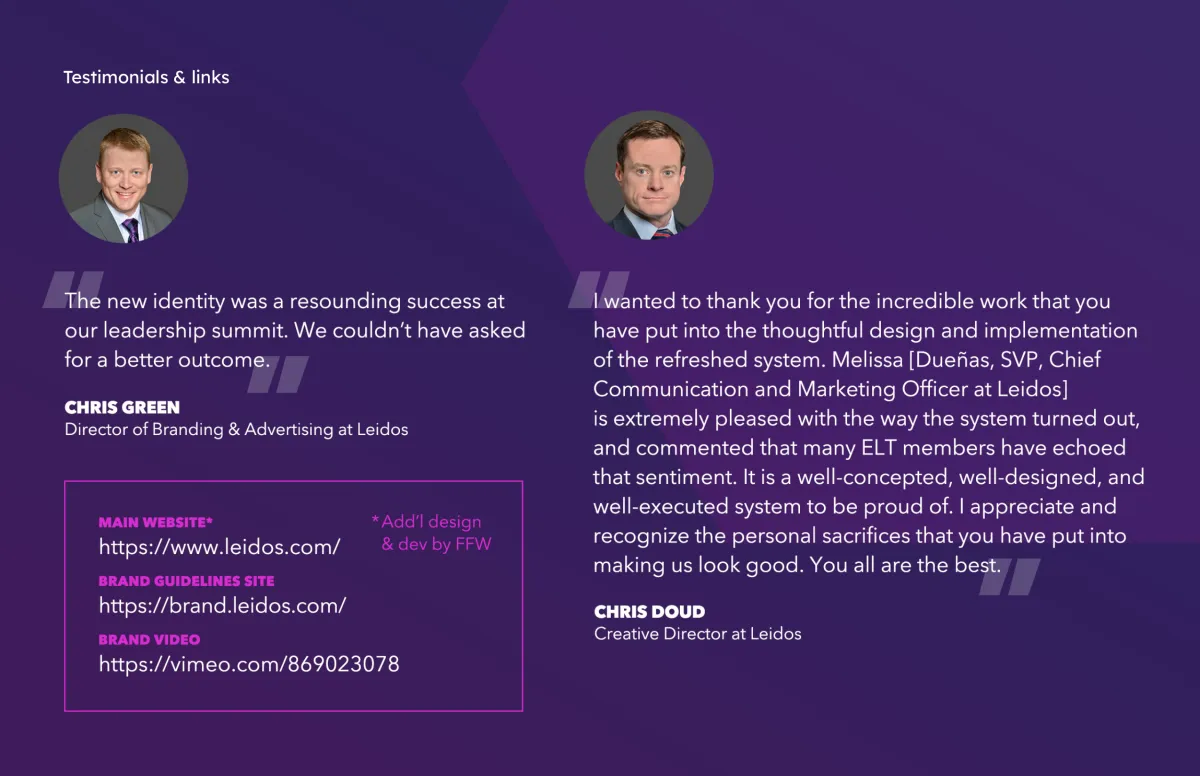
The visual identity won two Transform Awards North America in its category: Silver for visual identity and Bronze for creative strategy.
Dolby
A resoundingly successful rebrand
Project details
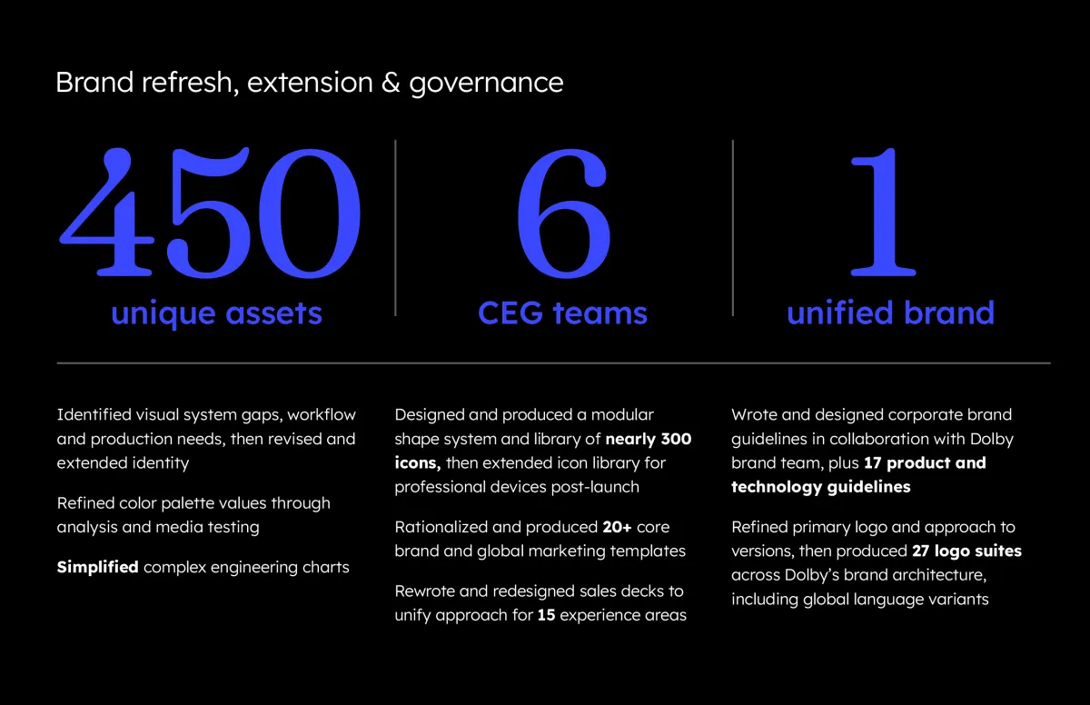
As a fractional Creative Director at Implementation Partners (IMP), I’ve had the good fortune to work with Dolby’s Consumer Entertainment and Brand groups for years on all manner of projects. From our early days creating their presentation templates and sales decks, to collaborating on the migration of their brand toward a more consumer-facing feel, it’s been rewarding to help them communicate what they innovate.
One of my favorite projects was the categorization and evolution of hundreds of icons. I created a modular grid-and-component system to ease icon development and workflow, which became useful immediately. It still is, as Dolby continues to expand their icon library to represent myriad audiovisual concepts within their experiential areas of focus.
The Sphinx Gate
Inviting an epic rite of introspection
Project details
Visionary founders Mareesa Stertz and Tania Abdul had already solved a tough problem: how to design, build, and bring two thirty-four-foot sphinxes, engineered to guard a rite of passage, to Burning Man. What the project still needed was someone who could help shape the story across everything the sculptures couldn't say on their own. To close that gap, I built a visual system rooted in the ritual's four thresholds: Mind, Body, Heart, and Destiny.
Alongside the founders, I mapped each threshold to an icon, then carried that thread through every communications surface the project touched. That included everything from promotional materials to the banners that formed the threshold portals themselves. The system became the connective tissue for a project that would go on to move thousands of seekers at the event and beyond.
The project received an Honorarium from the Burning Man Organization and was featured in Forbes for the way it turned deep inner work into something playful and communal. The same visual system is now helping carry the Sphinx Gate into its next chapter: touring festivals as Sphinx Portal.
Buffalo Bill Center
of the West
Re-centering a town's crown jewel
Project details
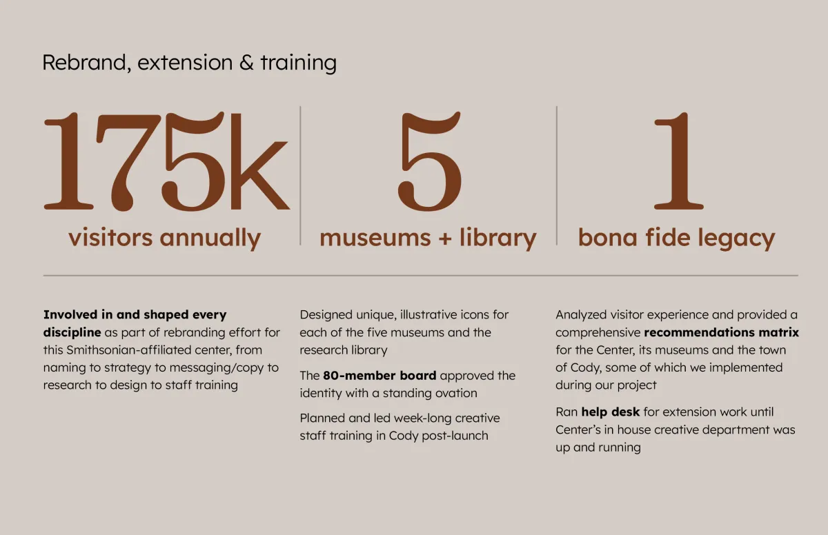
Nestled in William F. Cody’s namesake town of Cody, Wyoming, the Buffalo Bill Center of the West is a Smithsonian-affiliated, five-museum tribute to the American West. From Plains Indian artifacts to natural history to Western art, the Center displays an impressive array of stories and perspectives on our past and present.
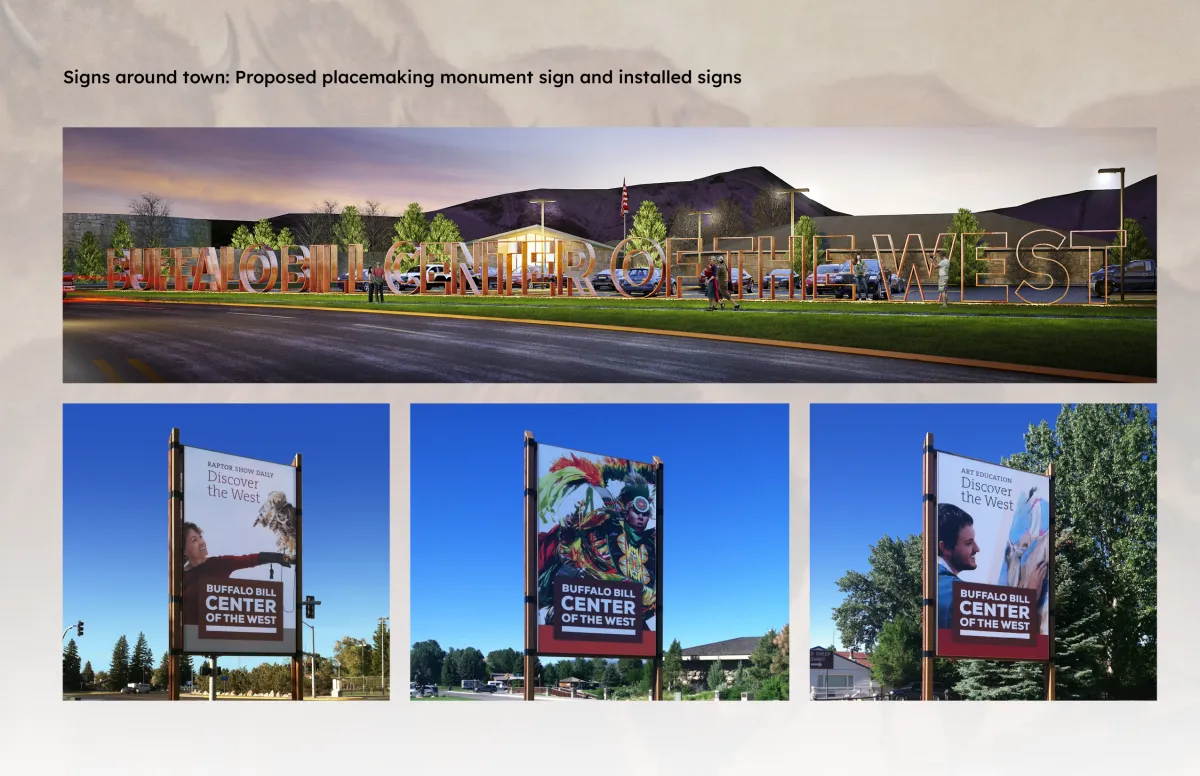
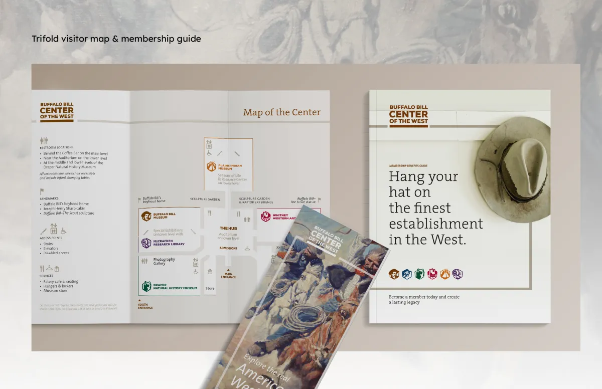
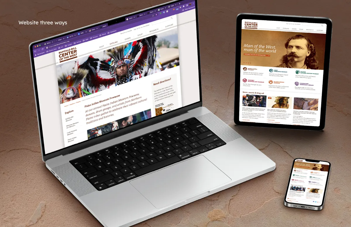
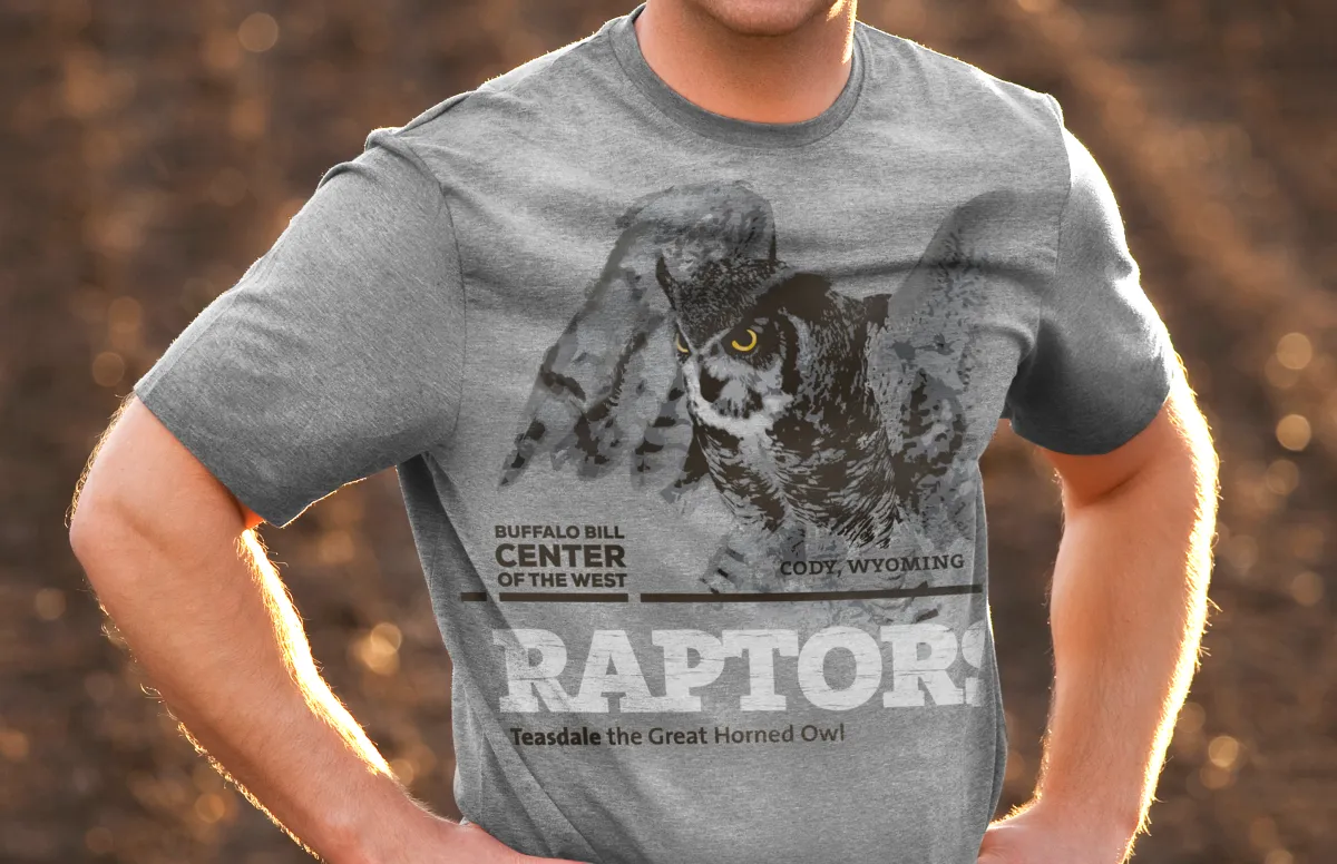
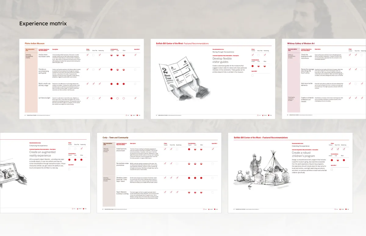
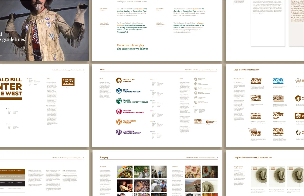
When the Center approached Siegel+Gale to help them unify their distinct museums under one identity system and draw more visitors, we happily obliged. Over the course of about a year, I worked to elevate their identity to a level consistent with their Smithsonian Affiliation by creating a new brand platform, name, logo, wayfinding icons and other proprietary graphics.
We then implemented this identity system throughout the museums, research library, print and digital collateral, and in an ad campaign that ran in neighboring states. I also developed and ran a workshop to train their staff in the new system. On seeing the final identity, the 80-member board gave it a standing ovation.

Leidos
Rotating the mechanics of wonder
Project details
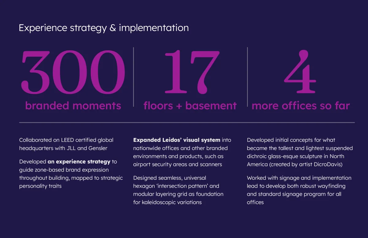
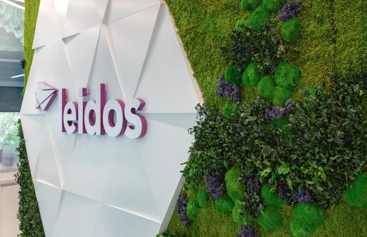
Known for their ability to tackle the world’s toughest problems, Leidos needed to solve the problem of evolving their brand identity and carrying that through physical spaces. To better reflect their core concept, the kaleidoscope, I designed a visual system focused on light, shape and rotation. Along with brand architecture and collateral tiering, this streamlined system helped consolidate their primary brand, integrate subsidiaries and recent acquisitions and prepare for an awareness campaign.
Alongside IMP’s founding partners, I developed an experience strategy that mapped Leidos’ personality attributes to colors, shapes, patterns and materials. Our system became the basis for 300 brand opportunities throughout their LEED certified headquarters. We designed and delivered everything from signage to murals to activity spaces to a green wall, and even commissioned kaleidoscopic sculptures for the lobby and executive floors.
The visual identity won two Transform Awards North America in its category: Silver for visual identity and Bronze for creative strategy.
Dolby
A resoundingly successful rebrand
Project details
As a fractional Creative Director at Implementation Partners (IMP), I’ve had the good fortune to work with Dolby’s Consumer Entertainment and Brand groups for years on all manner of projects. From our early days creating their presentation templates and sales decks, to collaborating on the migration of their brand toward a more consumer-facing feel, it’s been rewarding to help them communicate what they innovate.
One of my favorite projects was the categorization and evolution of hundreds of icons. I created a modular grid-and-component system to ease icon development and workflow, which became useful immediately. It still is, as Dolby continues to expand their icon library to represent myriad audiovisual concepts within their experiential areas of focus.
The Sphinx Gate
Inviting an epic rite of introspection
Project details
Visionary founders Mareesa Stertz and Tania Abdul had already solved a tough problem: how to design, build, and bring two thirty-four-foot sphinxes, engineered to guard a rite of passage, to Burning Man. What the project still needed was someone who could help shape the story across everything the sculptures couldn't say on their own. To close that gap, I built a visual system rooted in the ritual's four thresholds: Mind, Body, Heart, and Destiny.
Alongside the founders, I mapped each threshold to an icon, then carried that thread through every communications surface the project touched. That included everything from promotional materials to the banners that formed the threshold portals themselves. The system became the connective tissue for a project that would go on to move thousands of seekers at the event and beyond.
The project received an Honorarium from the Burning Man Organization and was featured in Forbes for the way it turned deep inner work into something playful and communal. The same visual system is now helping carry the Sphinx Gate into its next chapter: touring festivals as Sphinx Portal.
Buffalo Bill Center of the West
Re-centering a town's crown jewel
Project details
Nestled in William F. Cody’s namesake town of Cody, Wyoming, the Buffalo Bill Center of the West is a Smithsonian-affiliated, five-museum tribute to the American West. From Plains Indian artifacts to natural history to Western art, the Center displays an impressive array of stories and perspectives on our past and present.
When the Center approached Siegel+Gale to help them unify their distinct museums under one identity system and draw more visitors, we happily obliged. Over the course of about a year, I worked to elevate their identity to a level consistent with their Smithsonian Affiliation by creating a new brand platform, name, logo, wayfinding icons and other proprietary graphics.
We then implemented this identity system throughout the museums, research library, print and digital collateral, and in an ad campaign that ran in neighboring states. I also developed and ran a workshop to train their staff in the new system. On seeing the final identity, the 80-member board gave it a standing ovation.
Ready to launch a live event that inspires connection, introspection and metrics protection?
Click the button below and let's get it rolling!
I create an Event Impact Blueprint™ that outlines the emotional and storytelling arc of your event, along deeper services such as visual branding and wayfinding if you so choose, so you can focus on the vision and operations of your purposeful event.
© Copyright 2026. All rights reserved